Deregio
Client
Rency s. r. o.
Type of order
Cooperation
Credits
Adam Koukola (designer), Jakub Wittka (management), Radek Holík (art director)
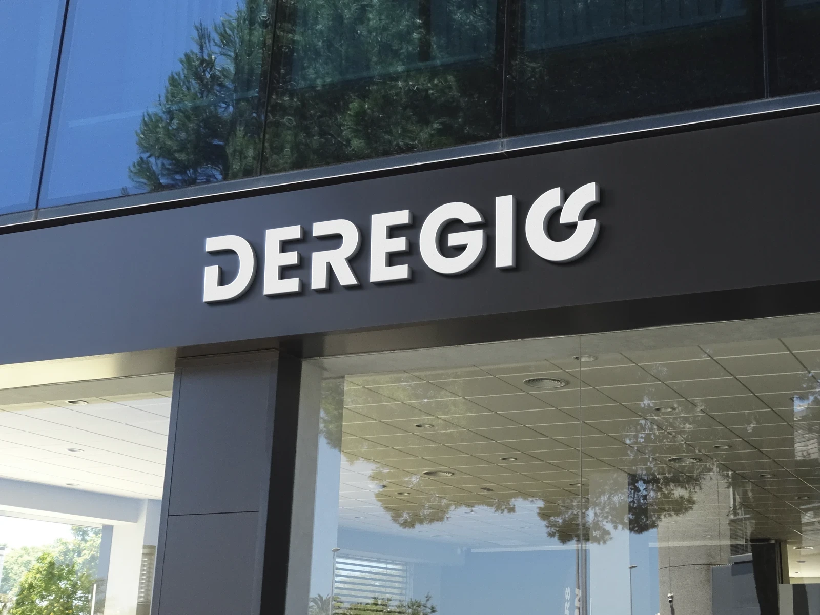
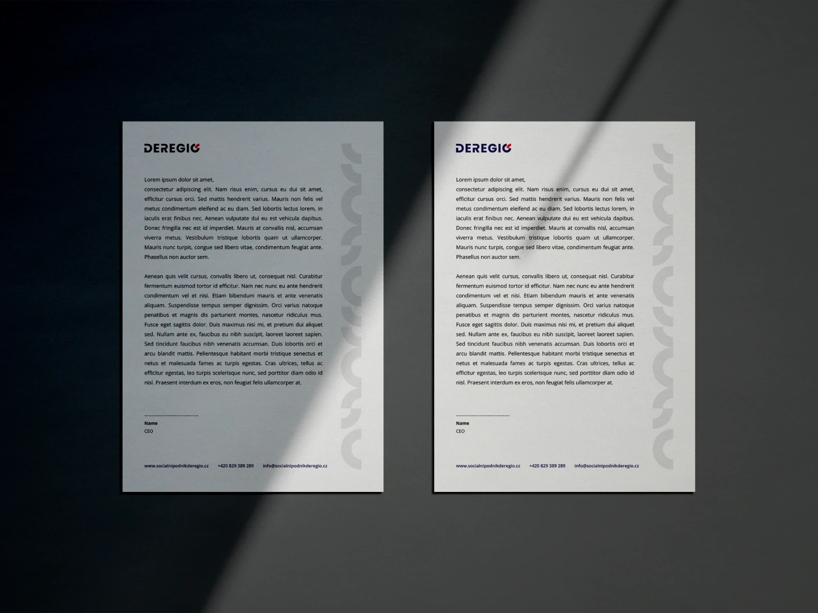
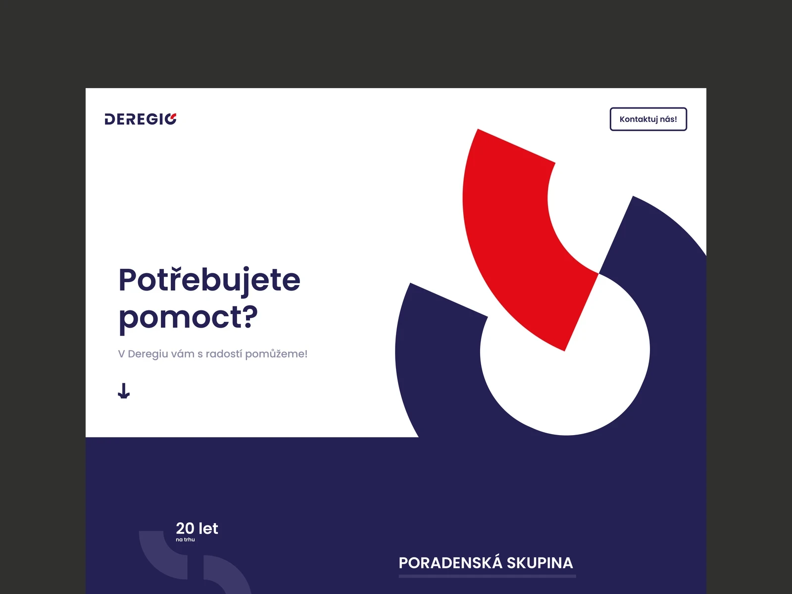
The logo consists of clean typography that has been modified to resemble the RPA branding associated with Deregio. The logo symbol is used instead of the letter O. The symbol consists of a circle that symbolises a sense of security. On one side, the circle does not end and is filled with a quarter of a circle. This phenomenon symbolises temporary help. Furthermore, the joining of the other half indicates joined hands, again a sign of help and security.
Within visual communication, a pattern has emerged that is complemented in some visual identity applications.